
This is my first attempt at a mock up for my magazine cover. It isn't particularly what I want my magazine to look like, but there are elements to it that I like. I have done this to experiment with what works well when composing the magazine, so I have a better idea of what is the most aesthetically pleasing and what matches my target audience. I have only got the very poor quality test shots to use before I take my actual photos, so I have had to improvise. Because the photograph is one of the key elements I have struggled to work out the rest of the cover without it. However, I think it has allowed me to look at other aspects of the cover that need special consideration. For example, the mast head is not particularly appealing, and doesn't represent my magazine or its genre well. The font also doesn't match the rest of the cover. Although, I had previously decided on my colour scheme, after applying it to this mock up I have realised that it doesn't match my target audience that is mostly female. Because of this, I plan to experiment further with colours that are considered more appealing to females. The magazine also doesn't fit in particularly well with the rule of three that applies to magazines. The page is not divided into thirds, resulting in it appearing disproportionate and therefore not aesthetically pleasing. The coverlines are also not very well positioned because they draw attention to the wrong part of the page, again making it not aesthetially pleasing to someone who would buy the magazine. Ideally I should of placed them in the bottom two thirds of the page. The photograph also doesnt follow the rule of three as they key parts such as the top of head and bottom of her face don't match up with the thirds. I do however like the fonts I have used for the coverlines and the main coverline, as I think they work well together, by mixing a more formal and informal font it gives the right impresssion of my magazine. I also like the white background and the black text, however I may need to re consider using this when adjusting my colour palette. I think the banner across the bottom looks good, but doesn't fit in with the rest of the page, as does the plug to the left, depsite matching the fonts and colour scheme. Overall, this first mock up needs a lot of changing but I have learnt a lot about what doesn't work and what does so I will use it to improve my other mock ups and then my drafts.
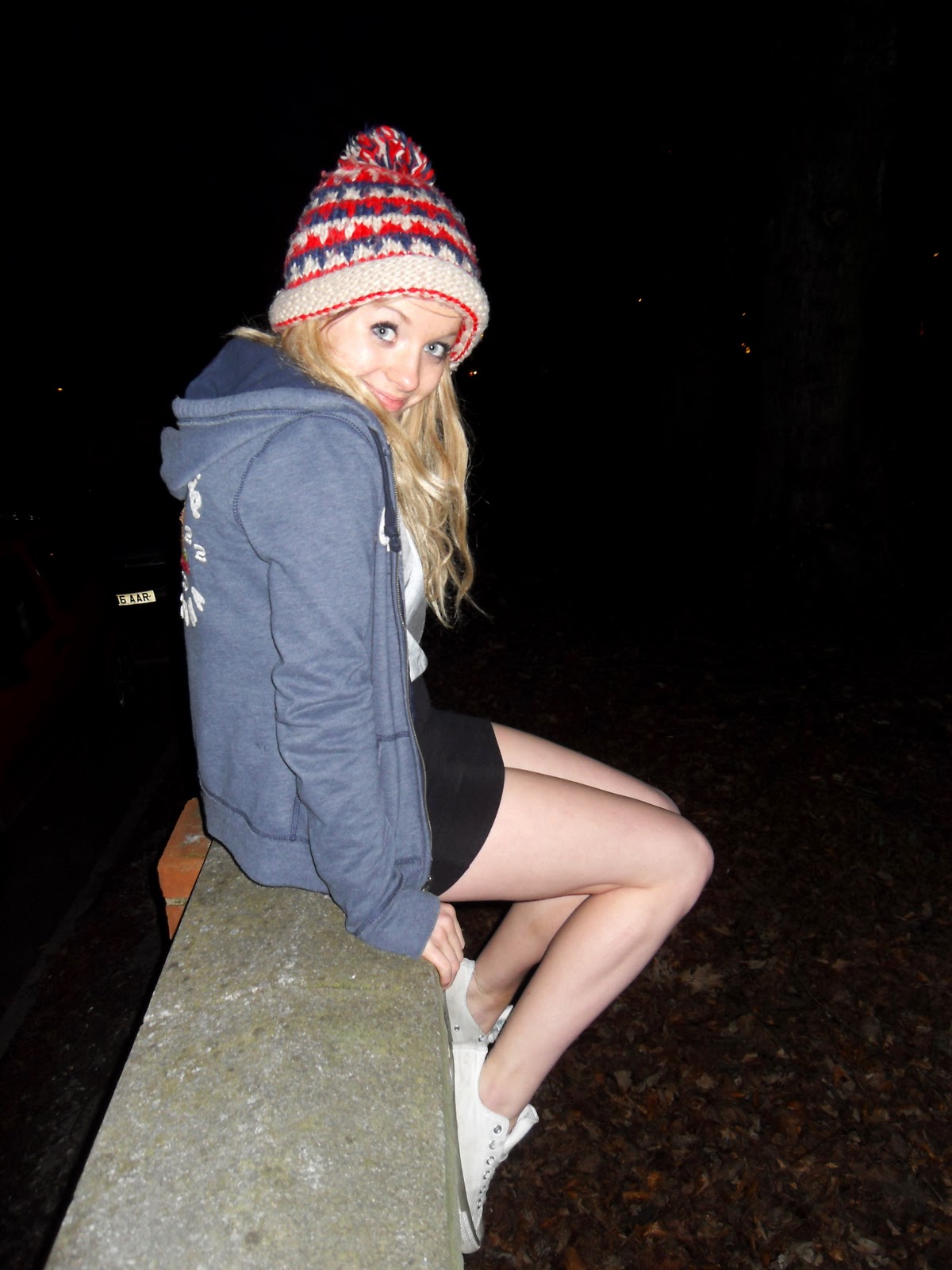


 For this photo Izzy is facing straight on, with her head off centre and looking away from the camera. Although I like how it's a mid shot, I think on the cover the artist needs to be looking directly at the camera. I like how she is stood as it I feel it would represent the personality of my artist; I don't want an overly 'showy' pose as I don't think would fit in with my magazine. I like the effect of the photo and that is quite light. For this kind of photo I would cut around Izzy as I think the background would need to be whiter. The picture is quite blurry so I have had to take this into consideration as they wont be when I use an actual camera. I think because of Izzy's hair parting, her looking from the opposite angle would be better as it would show more of her face, which I think would connect more to the target audience.


